
Guides · November 10, 2026
What a photographer's website should show first
A visitor decides in seconds whether your pictures are what they are looking for. Here is what to show first, how many pictures to show, and what the enquiry form should ask.
Photographers have a problem most businesses do not: the work is the sales pitch, and there is a lot of it. A year of shoots can easily mean thousands of pictures. A visitor has a minute, maybe less, and is usually looking at a phone.
So a good photographer website is mostly a set of choices about what to leave out. This guide goes through those choices in the order a visitor meets them: the first screen, the gallery, the enquiry form and the speed of the page. It ends with a short check you can run on your own site.
The first screen: work, name, place, next step
The first screen should answer four questions without a scroll: whose work is this, what kind of photography is it, where do you work, and how do I ask about a date?
Lead with one strong picture, or a short sequence of them, and put real text beside it: your name, what you shoot and your area. "Portraits and family sessions in the Boston area" says more than a logo on its own, and it is text that search engines and screen readers can read. Then give one clear way to reach you, such as an enquiry button in the header.
Skip the music, the intro animation and the "click to enter" page. They make a visitor wait before they have seen a single picture.
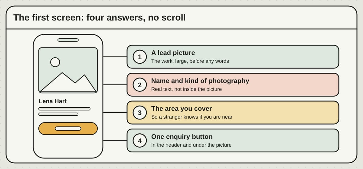
Try it: open your site on your phone and look at the first screen only. Can a stranger tell your kind of photography, your area and what to tap next?
Show twenty pictures, not two hundred
It is tempting to include everything. Resist it. A visitor does not remember the 150th picture, but they do notice the weak one at number 12.
A good portfolio is a short, strong set. Around twenty pictures is enough for most kinds of work, ordered so each one adds something: a wide shot, a close one, a quiet moment, a lively one. If you shoot more than one kind of thing, give each kind its own gallery and let visitors filter, so someone looking for a family session is not scrolling through product shots.
Pictures that tell a short story also work well. A single session shown as a handful of frames in order tells a visitor how you work, which a loose grid does not. Our image gallery page shows three looks for this on made-up businesses: a filterable portfolio, albums and a story layout, with a full-screen viewer so pictures can be seen large on a phone.
If you also sell prints, a shop can sit beside the portfolio, but keep it a separate page so the portfolio stays about the work.
Try it: write down the twenty pictures you would show a stranger with one minute to spare. Then look at your site and count how many of them a visitor sees first.
An enquiry form that asks the right things
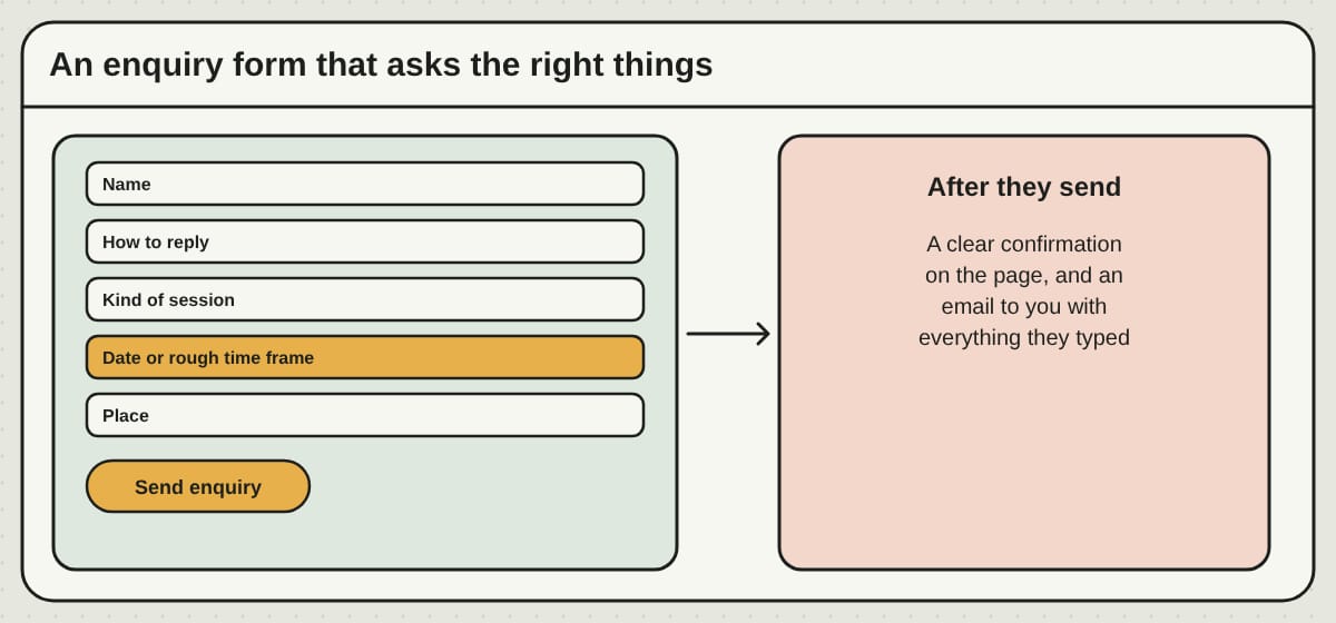
Most enquiries start with the same few questions, so ask them up front. A photographer usually needs a name, a way to reply, what kind of session it is, a date or a rough time frame, and the place. For events and weddings, the date comes first, because it decides whether you can say yes at all.
Keep the form short. Every extra box gives someone a reason to stop. Mark what is optional, and say when people can expect an answer, in a window you can keep. After sending, the visitor should see a clear confirmation on the page, not a blank screen.
Say plainly what the form is: an enquiry, not a booking. Private client galleries, contracts, invoices and payments for a shoot usually stay in the tools you already use, and the website links to them. That is a good division of labor. A site that tries to do everything tends to do each thing worse than a tool built for it.
Try it: send yourself an enquiry from your phone. Does it arrive, can you reply from it, and does the sender see a clear confirmation?
Prices: show something, or say how it works
Whether to show prices is a real choice, and photographers land on both sides. Some show packages, some show a starting price, and some show none because the fee depends on what the pictures are used for.
Any of those can work. What does not work is silence about how pricing happens. Even if you show no numbers, say how it works: "Sessions start with a short conversation and a written quote." A visitor who knows the next step is more likely to take it.
Keep the pages quick on a phone
Photographs are large files, and a page full of full-size originals can crawl on a phone connection. Before pictures go on the site, they should be sized for the web, not copied straight from the camera. Load the first picture first, and let the rest follow as the visitor scrolls.
We do not promise a speed number, because it depends on the visitor's connection and phone. But a page that shows the lead picture quickly and keeps the layout steady while the rest load feels fast, and that is what a visitor notices.
Try it: open your gallery on your phone using mobile data, not wifi. How long until the first picture is clear? How long until you can tap anything?
Say what you cover, and who you work with
A short About page earns its place. People hire a person, so show the person: a portrait, a few lines about how you work, and what a session is like. Add the area you cover, travel terms if you have them, and the kinds of work you take on or do not.
Reviews help, placed next to what they praise. Use only quotes the client agreed to, and never make one up. If you show a full wedding or a family session, do it with the client's agreement, and say so if a gallery is private.
What we do for photographer sites
At PageTend we build the site around your pictures and your look. There are five example photographer sites you can open, each drawn differently: Hartwell & Pine, a calm classic studio; Eleven Frames, cinematic; Posy & Pearl, soft and letterpress-like; Plinth Studio, colorful and commercial; and Umber Row Studio, a full-screen portfolio. The studios, prices and reviews on them are made up and the pictures are free stock photos. A real site is built from your own work, and we build it before you pay anything.
You can see all of them, and what stays in your other tools, on our websites for photographers page. After launch, changes come by email.
Questions we hear
How many pictures should a photographer's website have? Enough to show your range and no more. Around twenty strong pictures per kind of work is a good start; you can add stories and albums beside them.
Should I show prices? It is your choice. Show packages, a starting price or none, but explain how pricing works so a visitor knows the next step.
Can the website host my clients' private galleries? Private galleries, downloads and contracts usually stay in the tools you already use, and the site links to them.
Will a new website get me more clients? It can remove the things that put people off, but nobody can promise a ranking or a number of enquiries. Reviews, price and how fast you reply matter as much as the pages.
Rather not do any of this yourself?
We build your website, keep it current and look after your Google listing. You email us; we make the change.
More posts
 One domain, a website and your email: how they fit togetherYour website and email can use the same domain and still live with different companies. Here is how the pieces fit, what to write down first and what to ask before you buy.
 Wedding photographer website: a ready-made design or a custom one?A ready-made design can get a wedding photographer online without a blank page. Five checks before you choose, the sameness question, and when a custom design is the better door.
 Get your Google Business Profile verified, and what to do the week afterUntil Google confirms you run the business, your listing is only half yours. Here is how verification works, how long it takes, what to avoid while you wait, and what to do the week after.