
PageTend · Designs
These are looks. Not templates.
A template is a shape you pour a business into. These are starting points for a conversation. You tell us which one feels like you, and we draw your site from there - your words, your photos, your colors.
Open any one of them. They’re all live.
These are sample businesses we invented to show what each direction looks like — the names, the photos and the words are ours, not a client’s. Yours would be built the same way, with your own.
- Bold & Graphic
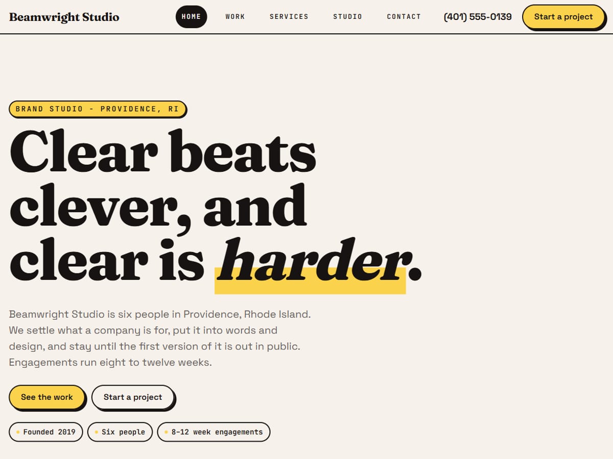
Beamwright Studio
Open the siteBig type, bright color and confident edges. Suits agencies, retailers or any brand that wants to stand out.
- Warm & Elegant
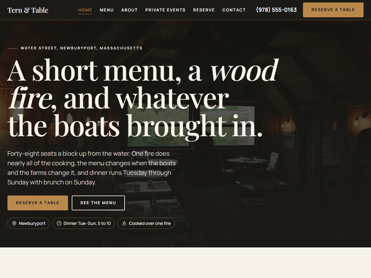
Tern & Table
Open the siteMoody, photographic and quietly upscale. Suits restaurants, hospitality or any business where atmosphere sells.
- Playful & Handmade
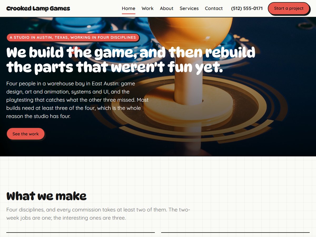
Crooked Lamp Games
Open the sitePaper-grid backgrounds, sticker-bright colors and rounded lettering. Suits game studios, creative shops and kids' brands.
- Bold & Direct
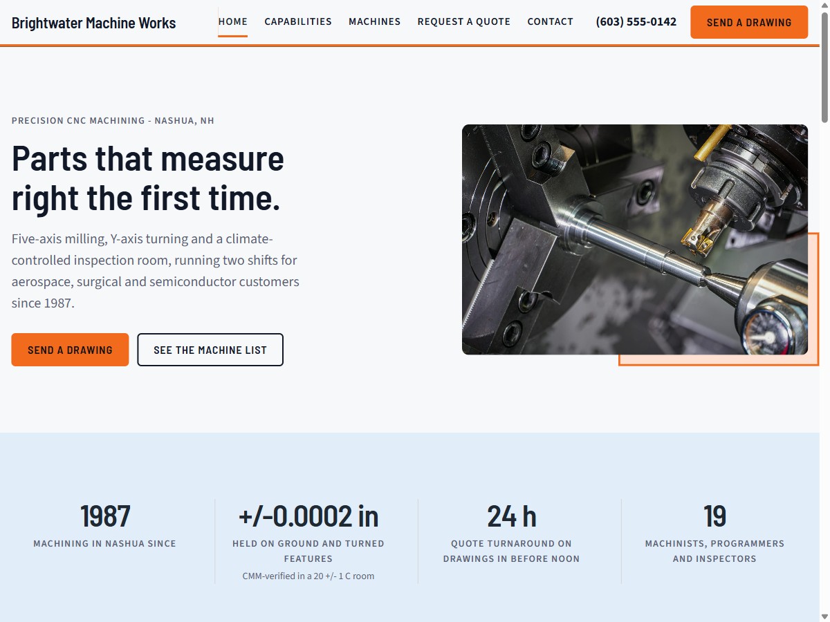
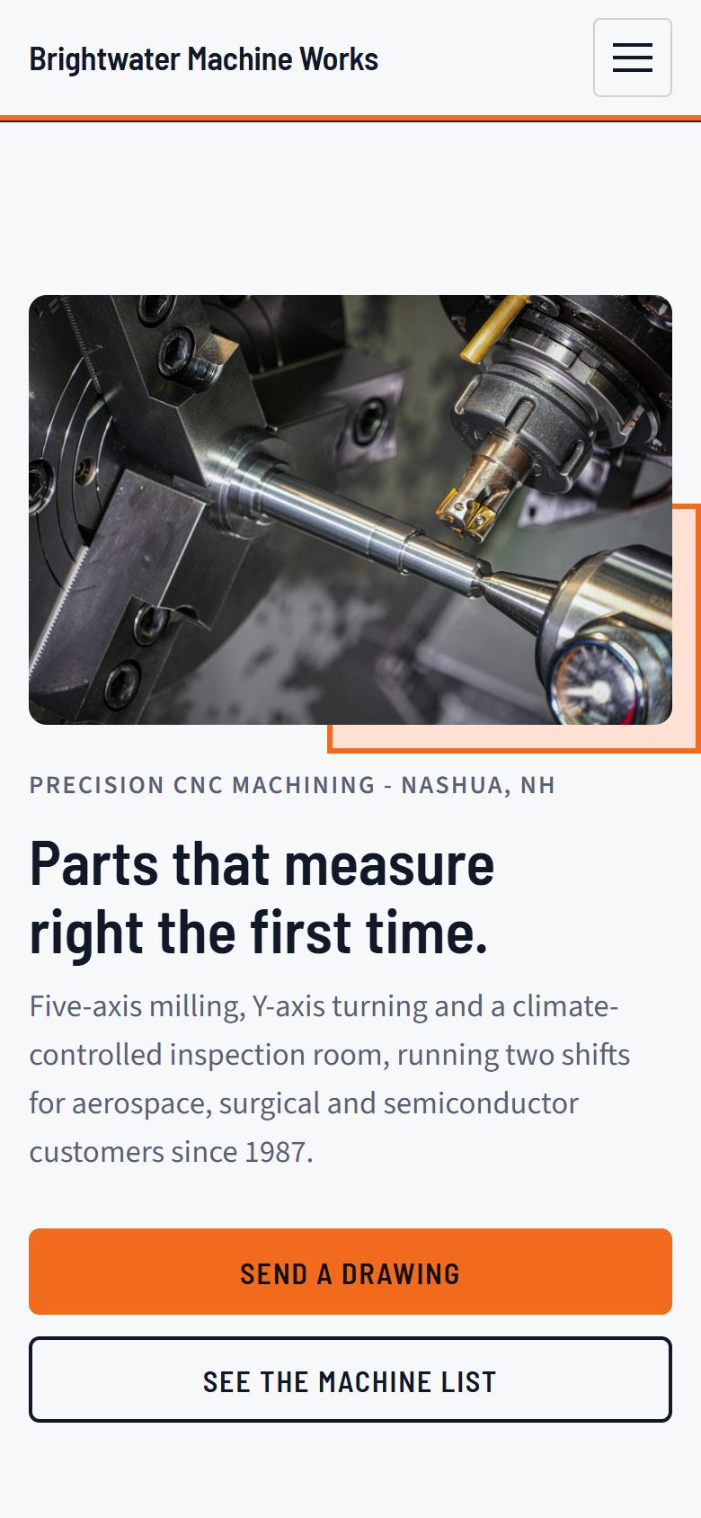
Brightwater Machine Works
Open the siteDark, sturdy and no-nonsense. Suits contractors, manufacturers and any trade that wants to look serious and capable.
- Warm & Personal
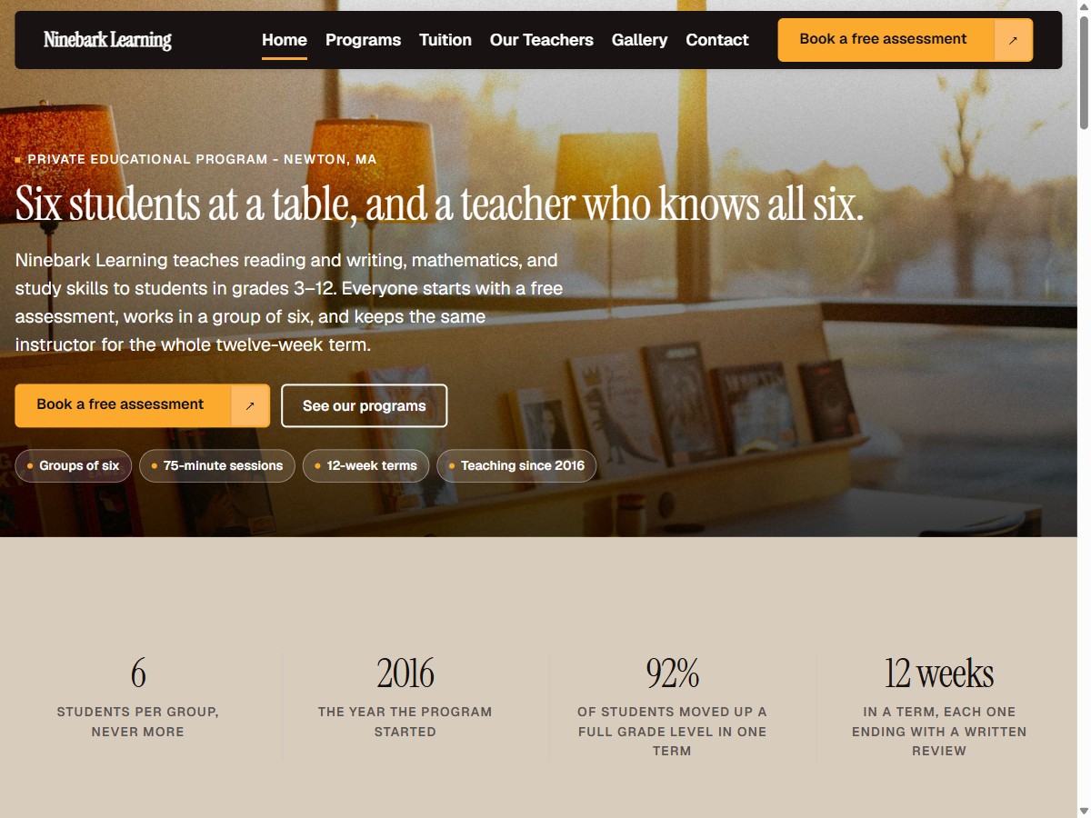
Ninebark Learning
Open the siteSoft colors and a friendly voice. Suits tutors, boutiques, small practices — anyone who wants to feel personal.
- Refined & Editorial
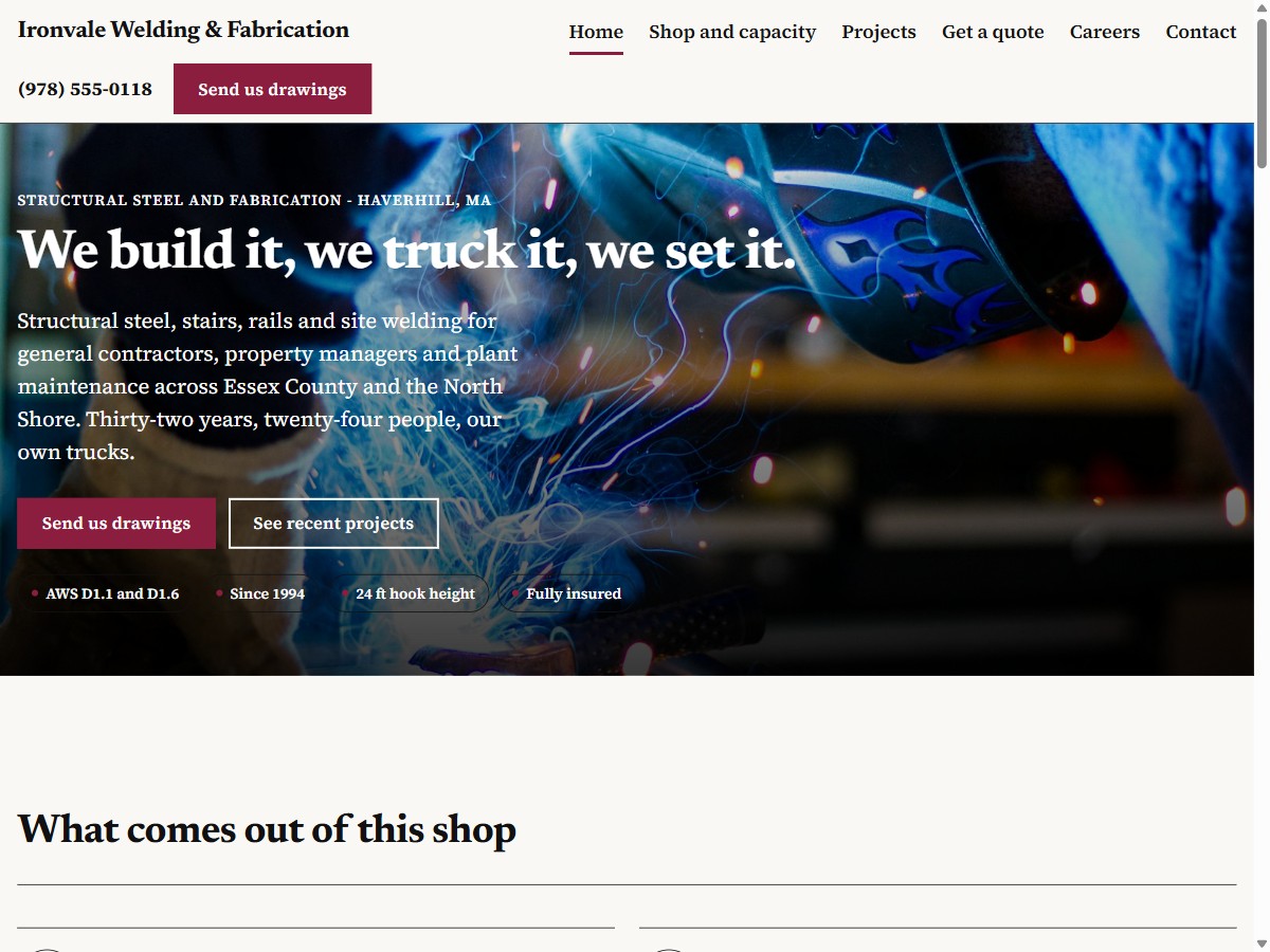
Ironvale Welding & Fabrication
Open the siteBlack-and-white, magazine-style polish. Suits fabricators, welders or any industrial shop that wants to look established.
- Confident & Corporate
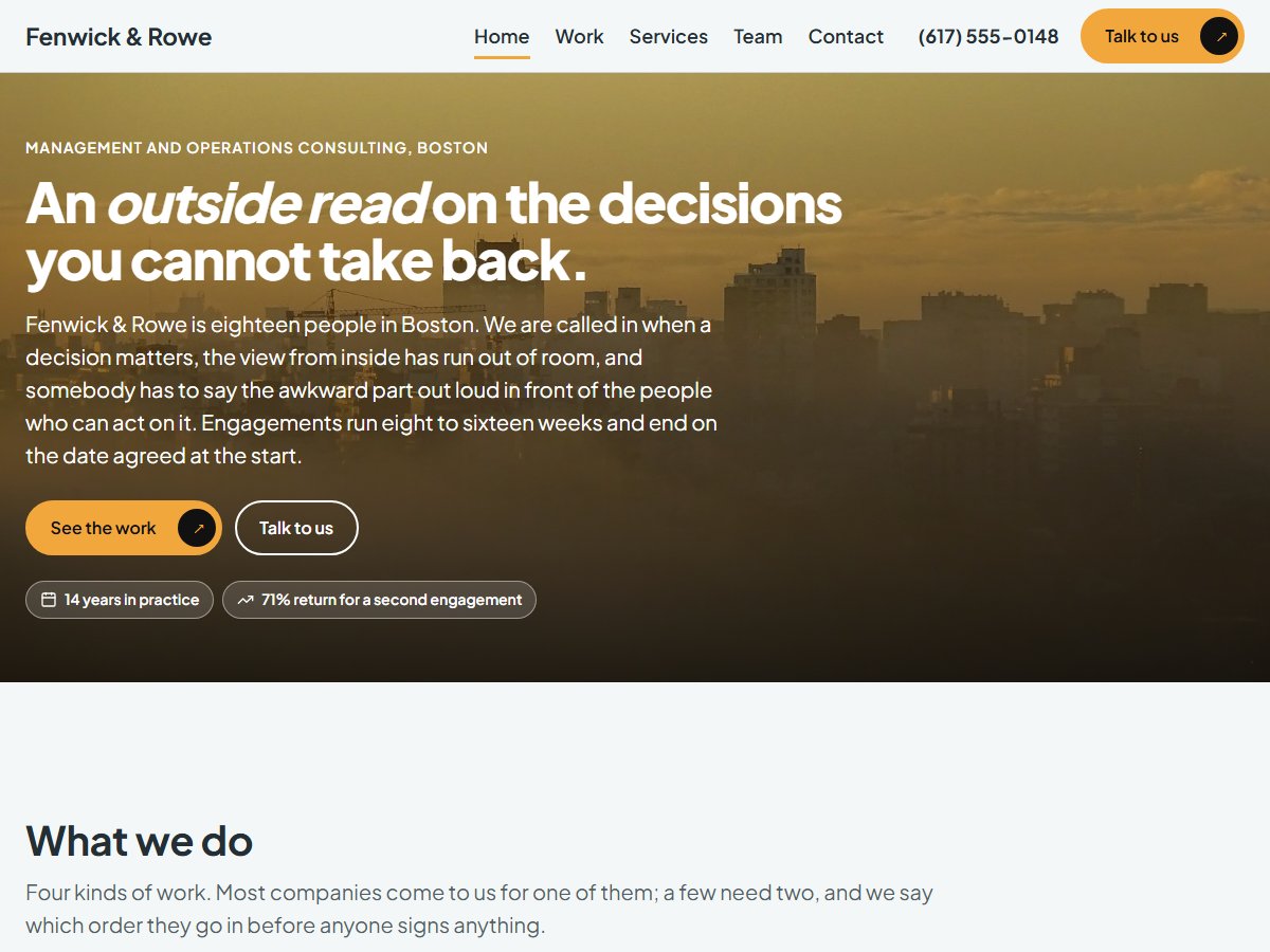
Fenwick & Rowe
Open the siteComposed, photographic and unhurried. Suits financial services, enterprise vendors or any business that needs to look ready for a boardroom.
- Bold & Immersive
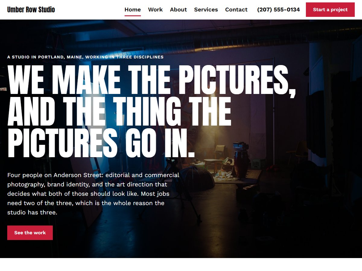
Umber Row Studio
Open the sitePhotography at full screen and a wall of work with nothing in the way — the pictures do the talking. Suits photographers, designers or any business whose work is the best argument for itself.
- Classic & Reassuring
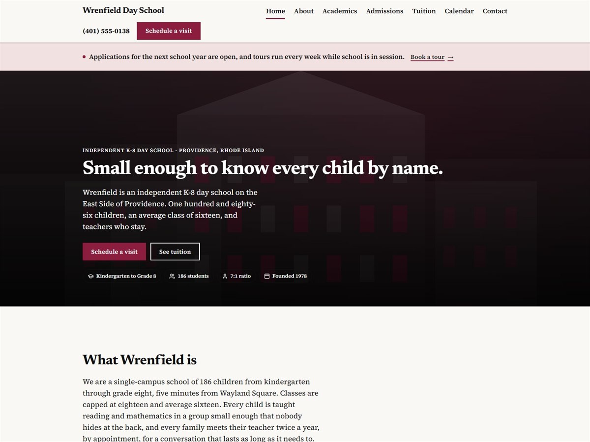
Wrenfield Day School
Open the siteSerif type, generous white space and the answers parents actually hunt for — tuition, the school day, how to visit — put in plain sight. Suits schools, clinics, law firms or any organization a family has to trust before they call.
Mobile first, not mobile also
Four out of five of your customers will only ever see this.
Whichever direction you pick, the phone layout is drawn first and the desktop version follows. The phone number is tappable. The address opens maps. Nothing needs pinching or sideways scrolling.
You don’t have to know what you want. You just have to react.
Most owners can’t describe a design, but everyone can say “not that one”. That’s all we need to start.
- 01
Point at one
Tell us which one feels closest, or just name a business whose site you like. Either works.
- 02
We build it for real
Not a mockup - an actual page with your name, your services and your town on it, at a link you can open on your phone.
- 03
React to it
“Too dark.” “Make the phone number bigger.” “I hate the green.” We redraw it. As many rounds as it takes, before you’ve paid anything.
Which one is your business? Let’s find out.
Give us the business name and we’ll build one of them out properly - a real page, with your words in it - and send you the link. Free. No card, no call, no obligation.